The Genesis
Of Our Crest
Origin
The logo that is currently used as the First Apostolic Council's crest was created in the year 2001 and has been modified from its original design. Initially it served as the official seal of the council's newly installed diocesan.
The original crest design sketched by Bro/Deacon Torrado Carter under the direction of the late Honorable Bishop Melvin Boyd in 1977. The original logo design differs from today's version because back then it contained the diocesan's own name and title.
Description
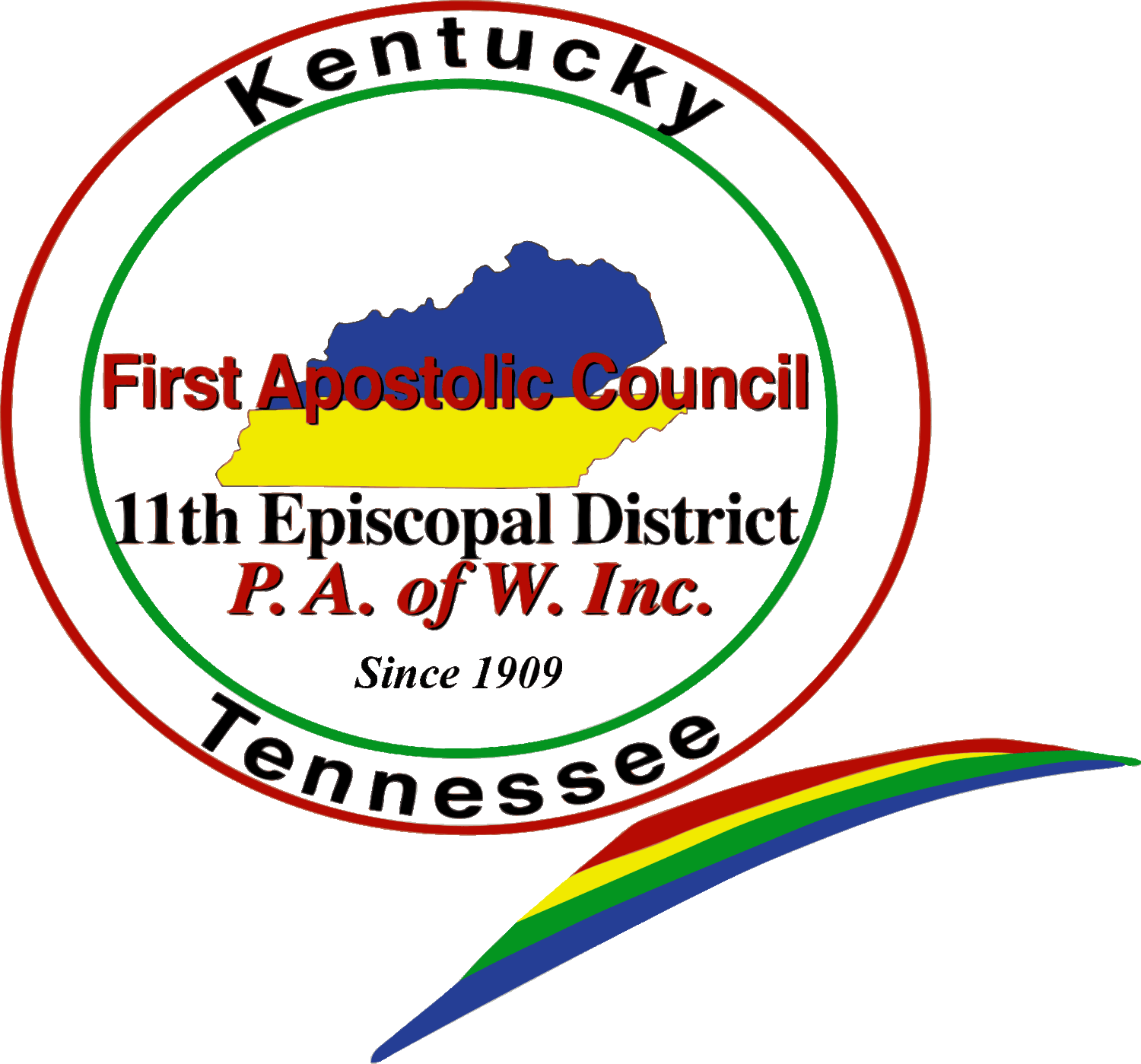
The current council logo is a multicolored crest of red, green, blue, black and yellow. It contains two circles (one within the other); the names and images of the states of Kentucky (in blue) and Tennessee in yellow. The words, "First Apostolic Council", "11th Episcopal District" and P. A. of W., Inc. also appear. A multicolored ribbon, patterned after the similitude of a sword, appears on the bottom right of the design. In the year 2009, a resolution that had been submitted by F.A.C. council historian Dr. La Monte McNeese passed in the general assembly authorizing the addition of the words, "since 1909".
Philosophy
As a circle has neither a beginning nor an end, the two circles represent "oneness" - The outer circle represents oneness with God and the Apostolic Doctrine and oneness within the council (thin inner circle). The original intent was to promote and further strengthen unity among the brethren. The maps of Kentucky and Tennessee were originally placed to convey the fact that the entities could be joined by common ground, and yet maintain individuality and character.
The multicolored sword-like ribbon was formally crested near the top of the design. It was later positioned at the base of the logo towards the right. This sword similitude represents the Word of God while the ribbon itself represents support of the diocese and the desire for it to continuously move forward in a positive direction.
The colors are said to symbolize God's covenant, promises, and a reminder that salvation is free to all regardless of race, nationality, or ethnicity.
Ownership & First Appearance
Its first appearance was in August of 2001, during the first F. A. C. Leadership Summit. At that time the logo was monogrammed on bags and printed on conference materials with the caption, "Leadership Summit" incorporated into the design for that particular meeting only. During this conference, in one of its sessions, the Executive Board expressed the desire to adopt the design as the official logo of the Council, to which Bishop Boyd consented. In July, of the year 2002, the Council modified the logo for its own use and thus, the F. A. C. logo, in its modified form, is the intellectual property of the First Apostolic Council of Kentucky & Tennessee.
Purpose Then & Now
Originally, the seal was to portray some of the ideals, principles, and beliefs that the newly installed diocesan embraced both personally and professionally. Today, the logo imparts a confluence of messages related to our apostolic mission. When officially displayed, the council logo presents the date that we began forming, the doctrine that we espouse, the affiliation that we cherish, the boundaries that we evangelize and the name by which we are called.
Source/Info
Historical records of Grace Apostolic Church, Nashville, TN.
Pastor Michael L. Boyd, Th.D. (March 2010).
Names of the "actual" creators of the original seal were not disclosed.
Portions of this report were edited for council relativity by the undersigned.
Original submission is available for review upon request.
Historically submitted,
Dr. L. McNeese
Historian, F.A.C. of KY & TN